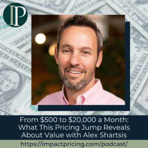
 Michael Mansard, Principal Director of Subscription Strategy at Zuora, joins Mark Stiving to challenge one of pricing’s most accepted conventions: the order of good, better, best.
In this episode, Michael shares original research showing how simply changing the display order to best, better, good can significantly increase purchase intent and revenue. Drawing on behavioral economics, loss aversion, and real-world testing, he explains why buyers react differently when the most expensive option is presented first.
Podcast: Play in new window | Download
Why you have to check out today’s podcast:
- Learn how reversing plan order increased top-tier selection by 15 points in controlled testing.
- Understand how loss aversion works against you in traditional pricing pages and how to flip it.
- Discover when best, better, good works and when it can hurt retention and Net Revenue Retention (NRR).
“By simply changing the order of plans, we increased revenue by nearly 11% without changing price or features.”
– Michael Mansard
Topics Covered:
01:16 – Best, Better, Good vs. Plan Order. Why the order of pricing plans matters and how flipping it can change buyer decisions.
06:23 – The Compromise Effect in Decision-Making. Why buyers gravitate toward the middle option and how loss aversion shapes that behavior.
08:11 – How Plan Order Impacts Choice. What happens when the most expensive plan is shown first and why it reframes value.
11:39 – Pricing Strategy and Consumer Behavior. How buyers justify decisions emotionally versus rationally when evaluating plans.
15:10 – Rethinking Good, Better, Best. Why traditional pricing layouts may limit revenue and when best-first works better.
18:11 – Customer Satisfaction and Pricing Strategy. Risks to churn and net retention and why right-selling matters more than upselling.
22:53 – How to Test Monetization Strategies. Why A/B testing, qualitative feedback, and small-scale experiments are essential.
Key Takeaways:
“A very basic tweak, changing the order from good, better, best to best, better, good, can lead to significant revenue uplift.” – Michael Mansard
“Best, better, good reframes the buying question from ‘Is it worth paying more?’ to ‘Why wouldn’t I choose the best?’” – Michael Mansard
“Loss aversion means the feeling of losing is much stronger than the feeling of gaining.” – Michael Mansard
“Pricing pages should make trade-offs clearer, not more confusing.” – Michael Mansard
Resources and People Mentioned:
- INSEAD – Where the research originated through executive education
- Loss Aversion Theory – Behavioral principle driving buyer choice
- Goldilocks / Compromise Effect – Why buyers avoid extremes
- Disney+, Wix, Apple – Examples of best-better-good pricing
- SurveyMonkey – Example of plan order varying by segment
Connect with Michael Mansard:
- LinkedIn: https://www.linkedin.com/in/michaelmansard/
- Article: It’s Time to Flip Good, Better, Best on Its Head (published on LinkedIn)
Connect with Mark Stiving:
- LinkedIn: https://www.linkedin.com/in/stiving/
- Email: [email protected]
Full Interview Transcript
(Note: This transcript was created with an AI transcription service. Please forgive any transcription or grammatical errors. We probably sounded better in real life.)
Michael Mansard
If we push to best-better-good, the good news, it’s probably going to make the pricing page even clearer. Because if you do it, that means that you want to make clear about the trade-offs you’re making between the plans. So it will have to be visually clearer than it is today, by design.
[Intro]
Mark Stiving
Welcome to Impact Pricing, the podcast where we discuss pricing, value, and the best, better, good relationship between them. I’m Mark Stiving, and I run bootcamps to help companies get paid more. Our guest today is Michael Mansard. Here are three things you want to know about Michael before we start.
He is the Principal Director of Subscription Strategy at Zora. He’s the EMEA Chair of the Subscribed Institute. And he’s led research on monetization of Gen AI and subscription pricing models. He’s, by the way, the inventor of the Compass Framework you hear us talk about and write about quite often. Welcome, Michael.
Michael Mansard
Hey, Mark. It’s good to be with you.
Mark Stiving
Hey, it’s gonna be fun. So you wrote an article the other day, and I’ve had this thought in the past as well, so I thought it was interesting, but it was best, better, good, instead of good, better, best. So why would you even think about this?
Michael Mansard
It’s a great question. So, well, first off, you know, good, better, best, I think has been a victim of its own success. It’s been overanalyzed. It’s oversubscribed. We’re probably all bored of reading the same old things. Even I contributed to the noise with a white paper some years ago, you know, I benchmark good, better, best ratios.
So, you’d think, to your point, that nothing was left to write. But today, hopefully I’m going to be able to share some provocative insights. And as you’ll see, it’s a very basic tweak, as you say, best, better, good versus good, better, best display order. But it can lead to significant revenue uplift. We’ll discuss how, and we’re talking about not small, right? 10% revenue uplift.
That may explain also why it could be a well-kept secret, in a sense. So if you’re interested, I can walk you through, let me call them the three ingredients. I’m going to say ingredients because I’m French, so I love food. I use the word ingredients. The three ingredients of how I came to that research. Does it make sense?
Mark Stiving
Okay, let’s hear it. Let’s hear it.
Michael Mansard
So, an important part of the story, which is not part of the three facts you mentioned, by the way, is I have the pleasure to have co-created and co-teach at INSEAD for Executive MBA and Executive Education with my very dear friend, Professor Wolfgang Ulaga. So INSEAD, I-N-S-E-A-D, for those who may not know, it’s one of the top international business schools.
And we’ve trained about 400 participants through a program called the subscription business bootcamp. And that was the catalyst for the research. So three ingredients. First, you know, during the classes, we often talk about the importance of psychology and we touch and we do this fun experiment around the loss aversion principle.
So, if I try to make it very simple, loss aversion, it’s a cognitive bias in psychology where the feeling of losing is much, much stronger than the impact of earning something. So if I make it very simple, losing $10 feels about twice as bad as finding $10 feels good, right? So one way we test loss aversion during the bootcamp is through hotel rooms, right, Mark?
So if I give you a list of hotels ranked from the most expensive to the cheapest, there’s a very, very strong chance that Mark will end up picking a much more expensive hotel than if I gave Mark the same list ranking from the cheapest to the most expensive. That’s the first ingredient. The second ingredient during that same class, we talk quite a bit about good, better, best.
And it’s probably the first thing I learned about monetization many moons ago. 80% of software using it, Netflix, Disney Plus, when you buy fuel or airline tickets, you see good, better, best. And in class, we actually dissect why it’s so powerful, why it’s so popular. And we highlight, again, several mechanisms that we probably all know, the anchoring effect, because you got the good and the best, nudges, compromise or Goldilocks effect, our tendency to avoid extremes, and finally, most important, loss aversion that I just discussed.
Because to be honest, it kind of hurts you when you have to take a cheaper plan and you’re losing features. So again, we demonstrate good, better, best hands-on during the class. And six years ago, there was this bulb in my brain when I connected the two because on one hand we say good, better, best but we run them from cheapest to most expensive. So what would happen if you were to actually show best, better, good?
Would it increase the last version effect? Could it drive higher revenue? And that’s the starting point, Mark. And the last, I said three ingredients, the last ingredient was synchronicity. So I was starting to do this kind of little test on best, better, good, for fun in the wild, very small sample. And actually I subscribed to Disney Plus and I saw premium, standard, and starter with ads. Best, better, good. Then I actually checked for another research, Wix, the website builder.
Four plans, business elite all the way through light. Very best, best, better, good. And my iPhone, I had to change my iPhone. Guess what I see? Three iPhones, iPhone Pro, iPhone, and iPhone E. Best, better, good. So I was like, gosh, I need to go to the bottom of this. And that’s where I started to actually start my research on that very topic. Does it make sense?
Mark Stiving
Absolutely. Absolutely. So, can I say what I heard you say?
Michael Mansard
Yes.
Mark Stiving
But in slightly different words.
Michael Mansard
Sure.
Mark Stiving
First off, why does good, better, best work? The one that I use all the time, and you can tell me how this fits in your thinking, is we always choose the one in the middle because we’re afraid to make a mistake. We think if we buy the cheap one, it’s not going to be good enough. We think if we buy the expensive one, we’re wasting money. So we buy the one in the middle. You might call that the compromise effect.
Michael Mansard
Absolutely. It calms your buying anxiety, Mark, let’s say.
Mark Stiving
Yes, yes. So now I want to jump into why I think best, better, good works better than good, better, best works, if I may.
Michael Mansard
Please do.
Mark Stiving
So you brought up the concept of loss aversion. And so, if I go from good to better, the loss is the more money I have to pay. The gain is the additional features I get. And we know that losses loom larger than gain. So, therefore the money I have to pay feels bigger than the feature set. But if I go the other way, if I go from better down to good, the loss is a feature set.
The gain is the difference in price. And so, now losses loom larger than gains. So it overemphasizes the fact that I lost that feature set rather than I gained in the price set. So I think that’s exactly what you found. And I love that you found that.
Michael Mansard
It’s exactly right. It’s in fact very basic. It’s simply applying a principle that should be core. And in fact, when you think of it, the fact that we’ve been calling it good, better, best the whole time kind of creates a psychological bias where people think that because it’s called good, better, best, it should be shown as good, better, best. And I was challenging that very principle, to your point, and see if loss aversion that you just described would be stronger.
Mark Stiving
Okay, and so what results, did you actually find these results in the wild?
Michael Mansard
So let’s say, I did a very small empirical research and I found some of these results, but it was not enough. So that’s where I started doing a bit more of research. So what research are we talking about? So I did what’s called a double blind survey, right? Two groups, I’ll come back to that after. And I had one key variable, which was the order of the plan.
Everything was the exact same thing, except that one was good, better, best, and the other one was best, better, good. So first, I needed an excuse. So I needed to survey something that was simple enough to understand and that people cared about. Guess what I took? Agentic AI service for consumers. That was trendy. And then, also, I wanted to make sure that people would not overthink and understand the trick I had. So that’s the first thing.
Second is, so by the way, just to be clear, think of it as an AI assistant that runs on your phone and makes your life easier, filters your calls, these kinds of things. And I had some attributes, you know, so reasoning capabilities. Think of it as, is it a helpful friend? Is it a skilled advisor? Is it a top expert? I had a fictitious responsiveness level.
I don’t know what that is, from one to three, you know, as you can imagine, best being three and good being one and the middle one being two. I had the number of interactions per month, a hundred, 500 and limited, and a couple more attributes. And my goal, again, was for people to think that I’m really trying to find the right pricing for that, or packaging for that offer.
So half of the people surveyed would see good, better, best, and the other half would see best, better, good, group A, group B. And I surveyed 440 people using a randomizer, 220, 220 in each group. And I asked them three questions, Mark. One was, which of the three plans would you most likely subscribe to? That’s the core question. The second one, I really wanted to see if I could prove that the loss aversion principle was increased somehow.
So I asked, can you briefly explain why you chose that plan specifically? And last question, I’ll come back to that. I asked people, what’s your native language? Do you read from left to right, right to left, top to bottom? I’ll come back to that. And my goal was clear. I just wanted to compare purchase intent, you know, and look at the baseline, which is the traditional good, better, best group. And the results are pretty much what you’d expect.
Mark Stiving
Okay. What do I expect?
Michael Mansard
You tell me. Exactly, Mark.
Mark Stiving
So I would certainly expect higher package choice in best, better, good than I would in good, better, best. So, but it feels like there’s a bunch of caveats here that are about to come up.
Michael Mansard
For sure. So Mark, so first off I had to put on my hat and my glasses to do some calculations to actually demonstrate that my sample was statistically significant. Because it’s great to have a conclusion, it’s better if the conclusion makes sense. Good news, it was. Then I actually had to deep dive in the results.
So group A, good, better, best, which was my test group, if you will. Results were completely predictable. The Goldilocks effect was in full swing, exactly as you described. You got the classic, most people are in the middle one. Actually, I had a bit more people on the top tier and a bit less on the middle one. So that meant that the top tier was really attractive by design.
So that still helps me. But most of the people were in the middle group, 39%, and then 33% in best, and 27% in good. So the classic distribution you’d expect, skewed a bit more towards best than usual. But that’s okay, at least it’s a control group, it’s a reference. So it shows to me that the group and the offer was well calibrated.
Then comes the best, better, good group. Let’s call it group B. And that’s where it gets really interesting. So what happens? When the first option is shown first, it gets the highest subscription intent. 49% of people chose best. Almost half of the group. Straight for the top tier.
Mark Stiving
And what was it before? It was 33?
Michael Mansard
33%. You’re right. 15 points swing towards the most expensive products on the page. So if I try to do all the math, that means that just by showing, if we consider that this is real, I’ve increased my revenue by almost 11% just by changing the pricing page, essentially. So if you remember, I really wanted to test two things. One, which is, does it yield super economics? The answer is yes. We just showed it.
Second, is it due to an increase in loss aversion? So how do I do the second one? You remember I asked them some questions about their preference, why they chose the thing. So what I did is I did a semantic analysis of the response for each group and each tier. And if I do a very quick analysis, in good, better, best, the semantics show a lot of perceived rationality.
So when you ask people what they chose, the middle tier, the kind of thing you hear is balance, compromise. They write that themselves, right? So they were looking for that sweet spot. Now, when you look at the best, better, good group, it flips what I would say the emotional script entirely. So the respondents, they cared less about price and balance and compromise in what they wrote, which are very short summary, right?
They justified the choice about things such as quality, security, top tier features, right? And more interesting, by the way, people choosing the middle tier were more likely to say that they plan, they wrote it, I plan to upgrade in the future to the best tier, right? It was something like 14% of the response versus less than 4% in the other group. So that’s a significant difference. So they settled somehow for the middle tier, but they still saw that the best plan is the standard.
And by the way, they were harsher on the entry-level plan. So in the best, better, good group, the respondents were likely to dismiss the starter option, the good option, as too basic, insufficient, saying that the low price wasn’t worth the trade-off. So they’re essentially convincing themselves that the top and the middle tier are really good.
So that’s very surprising i.e. stronger loss aversion effect amplified by anchoring, which is very visible in best, better, good. And you kind of shift the emotional environment into, you know, which incremental upgrade is worth paying for, which is what you described, Mark, earlier. And you moved into, do I see a reason not to get the best in best, better, good? A very interesting shift.
Mark Stiving
It’s actually very fascinating. So the things that jumped to mind, obviously, Michael, you know I have to disagree with you, right? The things that jumped to mind is I’m guessing you did this with students, right? So they didn’t, and whoever, whoever the respondents were, they didn’t actually have to buy something. So it was all a mental exercise, which is how we typically do experiments in psychology. So, you know, we can’t take that away.
But when I was thinking about this a long time ago, I was thinking, if I were a salesperson, I would absolutely be presenting best, better, good. If I had a website where I had someone choosing for me, I would still go good, better, best. Now you can convince me that that’s wrong, but the reason I wanted to do that is because I thought people expect to see good, better, best.
And when they don’t see good, better, best, they get confused and are less likely to buy, because confused buyers don’t buy. And so, I’m not sure. I’d love to see, I’d love to hear from Disney, right? What was the impact when they switched from good, better, best, to best, better, good, right? Did it really make a difference? And I’m sure they’ve done that study.
Michael Mansard
Yes. So, by the way, Mark, as usual, we don’t disagree. We very much agree. So, let me go in order to your different questions. So first off, is it a theoretical exercise? Yes. What I don’t measure is the actual conversion. So that’s where you have to be careful. So the first caveat is, do you convert less but on a higher tier? And by the way, that can be a strategy. So I don’t have that data. Because of course, if I ask you for your credit card, it’s a different thing.
On the sample, by the way, the sample was quite diverse. It’s randomized, but I know the kind of people I tried to go after, which were mostly senior leaders and executives from my network. So I reached out to people one on one and I knew when they responded. I just didn’t know what was their responses. So that’s quite interesting. And I made sure to have a good diversity because I was also checking, if you remember, left to right, right to left, top to bottom.
So I had people from the US, Canada, France, China, Japan, Israel, Saudi Arabia. So I had a very diverse mix. It was mostly, let’s say, higher socioeconomic jobs, by the way, which is interesting because it seems that they’re very likely to check what they buy. I also had a lot of buyers, by the way, IT buyers. So that was interesting. Let’s say it’s for the first part. Linked to the second part, let’s call it evidence.
The fact that more companies are doing it quietly, for me, is an early indicator that it might be working. By the way, the second evidence I have, which is interesting, is SurveyMonkey. So SurveyMonkey, actually, depending if you are a consumer, let’s say a quasi-consumer, or an enterprise customer, they display it as good, better, best, or best, better, good.
And guess what? It’s best, better, good for consumers. Why? Because pricing is public. It’s good, better, best for enterprise. Why? Because the highest tier is enterprise, and the price is not disclosed, meaning it could not play, I believe, with the kind of psychological mechanisms we just discussed.
So, I don’t know, I don’t have the data for Disney+, nor SurveyMonkey, but the fact that more companies are doing it, including SurveyMonkey, which I hope does survey, I’m assuming they do, is a good, let’s say, leading indicators that it must be working. Now in terms of the last caveat. So hopefully that answers your question.
Mark Stiving
So real quickly, Michael, I don’t know that SurveyMonkey has to do a survey because they just have A/B testing going on there, as does Disney, I’m sure. And the fact that they’ve done A/B testing and it’s in best, better, good, I think that’s a really good indicator that it works for them.
Michael Mansard
Yes. It can be a good indicator. And on the last point, which is really important, I would say two things, which is on the website. First off, and it’s a caveat, I would not do best, better, good on very competitive, price sensitive markets because probably you don’t want to anchor by design the most expensive price. Think of, I don’t know, airlines that are focusing on low costs. It doesn’t make sense to put the higher price first.
So there’s definitely markets in which it does not apply. The second caveat is lifetime value. Because even if you increase acquisition, the question is, will customers feel tricked to have chosen the higher tier? Will they churn after two, three months? And you’d rather have happy customers in the middle tier than everyone in the top tier.
So one way to assess the caveat is that you have to watch customer satisfaction and utilization almost like a hawk, right? In the sense that you should know before your customers when they are overspending. And you should proactively guide them if you implement such a strategy to the right plan. So in my view, a good business is always right selling, right?
Even when it’s cheaper for the clients, because at the end of the day, otherwise it will churn. And if you right sell them and move them to a cheaper plan, they would actually remember it. And, you know, I don’t have a lot of data on that, but experience shows that it would dramatically improve lifetime value anyway.
Mark Stiving
Yeah, I like those. And as you were describing those, it suddenly hit me. There’s another issue going on. And that is if I sell you the best plan at the beginning, my NRR is going to suffer.
Michael Mansard
Exactly. So that’s definitely a risk. So that’s why, and I’m not saying you should do it this way, so as not to hurt your net retention rate, by the way, one way would be to mix that with what’s being called reverse free trial. So what is a reverse free trial? It’s a free trial in which you start on the higher tier.
So if you combine the two, in a way you exclude the trialers or the first month from the actual net retention rate, unless it’s a full churn, obviously, because that’s a problem. And it’s a way to kind of say, listen, this is the best of the best you can get. Obviously, some features would not apply for some customers.
So maybe you don’t do that at a price plan, obviously. But it’s a great way for people to test the weather on the best plan. And maybe then they would be more satisfied with the middle tier at the end of the day. So to your point, Mark, you have to be very careful so you don’t hurt your NRR, hence your valuation in the long run as well.
Mark Stiving
Yeah. Okay. So you hinted at this several times during the talk. You got to answer. Was there a difference between left to right readers and right to left readers?
Michael Mansard
So I want to be very transparent on that. So to your point, I want you to assess that, for example, given the eye movements, eye tracking, that best, better, good wasn’t just a quirk of Western culture, to your point. And even participants who had other reading directions, Arabic, Hebrew, even Japanese, because in some cases you read from top to bottom, in Chinese as well, they actually showed the same directional behavior, to my surprise.
So the data sets, just to be very transparent, are good to demonstrate what I wanted to demonstrate, but the sub-cohorts of the sub-cohorts for left to right, or right to left, are not large enough. So it’s directionally showing the same behavior, but I would say further research is needed, especially eye-tracking analysis. Fun fact, Mark, Professor Kai or Dr. Kai Wiedenke in Hamburg and his team actually reached out to me after I published the article.
So I published it as a blog post and then as an INSEAD academic research article with Wolfgang Ulaga. He reached out to me and said, listen, we’re actually doing the same research, we haven’t gone to the exact same conclusion, I’m doing the exact same thing but we’re doing eye tracking. And probably we’re going to merge our research at some point.
Mark Stiving
Nice.
Michael Mansard
So what I’ve been seeing, no pun intended, seems to be leading in the same direction. And he’s also focusing, if I understand correctly, on some of the limitations. So again, it’s not the panacea. It’s not the silver bullet. You have to be careful. But when it works, it seems to be working very nicely.
Mark Stiving
All right. Okay. Any other comments you want to make on this?
Michael Mansard
I would say, one, which is obvious, and I’m sure, Mark, you are going to agree with me on this one. My main advice is always the same as for any monetization strategy test. Test it. The advice is practical. Try best, better, good on a small scale first for each market or offer. Run A-B tests.
Do qualitative research, which is really important. It’s applicable probably for you, but don’t go full steam. That’d be my word of caution. And my last word would be, by the way, that driving more revenue is not just about complexifying your product. It can just be about the elegance of the psychology you use behind the product.
Mark Stiving
Yeah. And so, what’s fascinating about the whole research that you just did, it’s that most companies don’t think about best, better, good, right? We think just, hey, we’re just going to do it good, better, best, because we’ve always done a good, better, best. I don’t think B2B companies do, but I know that B2C companies focus on what size should the font be or what color should the font be, right?
Michael Mansard
Exactly.
Mark Stiving
And they certainly have some impact in A-B testing, but nowhere near the impact that you just found by switching good, better, best to best, better, good.
Michael Mansard
Absolutely. And I think if we push to best, better, goods, the good news, it’s probably going to make the pricing page even clearer. Because if you do it, that means that you want to make clear about the trade-offs you’re making between the plans. So it will have to be visually clearer than it is today by design.
Mark Stiving
Yeah. Excellent. Michael, great research. I loved hearing it. Thank you. If anybody wants to contact you, how can they do that?
Michael Mansard
Happy to connect on LinkedIn, by the way, the full article is published on LinkedIn as a blog. It’s called, It’s time to flip good, better, best on its head, how a tiny change can unlock 10% additional revenues. So happy to connect. So you can access the full blog, connect, follow me, do whatever you like, but I’m always happy to widen my horizons and point of views.
Mark Stiving
Excellent. To our listeners, thank you for your time today. If you enjoyed this, would you please leave us a rating and a review? And if you have any questions or comments about the podcast, or if your company wants to get paid more for the value you deliver, email me, [email protected]. Now go make an impact.
[Outro]